
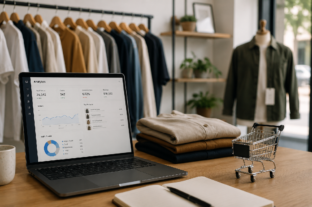
You check your Shopify analytics and, at first glance, things look fine. Sessions are up. People are coming from Instagram. Your ads are bringing in traffic.
But the orders aren't keeping up.
Maybe you're seeing a 0.8% to 1.5% conversion rate and wondering what's going wrong. Are the products not right? Is the pricing too high? Do you simply need more traffic?
Sometimes, the problem isn't the traffic or the products. It's what happens after someone lands on your store. A shopper can like what they see and still leave because they don't feel confident about the fit, can't find the information they need, don't trust the store yet, or run into friction on the way to checkout.
For apparel stores, these small points of hesitation can add up quickly. The good news is that you don't necessarily need a complete redesign to address them. In many cases, a few specific changes to the shopping experience can make it easier for visitors to move from browsing to buying.
Here are some of the most common reasons Shopify apparel stores lose sales and what you can do about them.
Not sure what's stopping your visitors from buying?
Our team will audit your Shopify store's conversion blockers product pages, checkout, mobile experience, trust signals and tell you exactly what to fix first. No charge, no obligation.
Get your free conversion audit →The reasons your visitors leave and the fixes that actually help
"The jacket looks great. But is the fabric heavy? Does it run small? What does it look like on someone who isn't a 5'10" model? I don't know. I'm not going to risk $89 on something I can't picture wearing."
Most apparel product pages describe what an item is, not what it's like to own it. Generic copy like "crafted from premium materials for all-day comfort" doesn't help a buyer in Chicago decide whether to click Add to Cart. What helps is specific, honest information: the fabric weight, how it fits compared to similar items, what customers say about the quality after washing it three times.
Apparel is tactile in a way that electronics and home goods aren't. The shopper can't feel the fabric or try it on. Your product page has to compensate for that gap and for most stores, it doesn't come close.
Rewrite your top five product pages with specific fabric details, honest fit descriptions ("this runs about half a size small, size up if you're between sizes"), and real customer quotes that mention how the item looks and feels in person. Then watch the add-to-cart rate on those pages over the next 30 days.
"I'm usually a medium but I've ordered mediums online before that fit like a large. I don't see a size guide. I'll just buy it somewhere else where I know the sizing."
Sizing anxiety is the single most common reason apparel shoppers in the US and Canada abandon without buying. And it's entirely addressable. The fix is not a generic size chart - S/M/L with no measurements. It's actual numbers, in both inches and centimeters, with guidance on how specific items fit.
The brands that solve this best include model measurements alongside the photo ("This model is 5'8" and wearing a size Small"), customer fit notes pulled from reviews ("78% of buyers say this fits true to size"), and clear guidance on what to do if you're between sizes.
Add a dedicated sizing section to every product page not a link to a separate size guide page that most shoppers won't click, but measurements displayed directly inline. Include at least one sentence of fit guidance specific to that product. This single change consistently lifts conversion rates on apparel product pages more than any other individual fix.
Over 70% of apparel eCommerce traffic in North America comes from mobile devices. Shoppers find your store through Instagram Reels, TikTok videos, and paid social ads - all on their phones. If the experience they find when they click through is slow, cramped, or requires too much effort to navigate, they leave. And they don't come back.
Common mobile problems in Shopify apparel stores: product images that don't zoom cleanly, size selection dropdowns that are hard to tap accurately, a checkout button that requires scrolling to find, and load times above three seconds that cause a significant share of mobile visitors to bounce before the page finishes rendering.
Pull up your own store on a real phone and try to complete a purchase from start to finish. Time it. Count the taps. Notice every moment of friction. The issues that annoy you in that test are the same ones losing you customers every day. Use Google PageSpeed Insights to check your mobile load score - anything below 60 on mobile is actively costing you sales.
"The products look good but I've never heard of this brand. There are only six reviews and they all sound kind of generic. What's the return policy? I don't see it anywhere obvious. I'm not putting in my card details."
New visitors to an apparel store are making a financial decision with no prior relationship with your brand. In the absence of trust signals, they default to caution. And the cost of that caution is a closed tab.
Trust signals for apparel stores aren't complicated. They're customer photos of real people wearing your products - not model shots but actual buyers showing how things look in real life. They're reviews that mention fit, fabric quality, and the return experience. They're a return policy that's easy to find and written in plain English. They're the Visa, Mastercard, and PayPal logos near the checkout button that tell the shopper their payment is going somewhere legitimate.
Email your 20 most recent customers and ask them to send a photo wearing their purchase in exchange for a small discount on their next order. Display those photos on the relevant product pages. Real customer photos even imperfect ones consistently outperform professional photography for converting hesitant shoppers.
A shopper spends ten minutes on your site. They find something they want. They add it to their cart, feeling good about the decision. They get to checkout and see $12.99 shipping on a $45 item that was described as "affordable everyday fashion." They pause. They reconsider. They close the tab.
Shipping costs revealed for the first time at checkout are one of the most reliable conversion killers in eCommerce and apparel brands are particularly vulnerable because the category attracts price-conscious shoppers who are comparing options across multiple stores simultaneously.
Show shipping costs or a free shipping threshold on the product page, not just at checkout. "Free shipping on orders over $75" displayed on the product page turns the shipping cost into a nudge toward a higher cart value instead of a last-minute deterrent that kills the purchase.
Shopify's native checkout is genuinely good. But it can still be undermined by requiring account creation before purchase, displaying irrelevant form fields, or not offering the payment methods your specific customers use which, in Canada, increasingly includes Interac and, in the US, includes a growing share of buy-now-pay-later options.
Every additional required action between "I want this" and "I bought this" costs conversions. Even one unnecessary step can measurably reduce checkout completion rates.
Enable guest checkout if it's not already on. Remove any non-essential form fields. Add Shop Pay, Apple Pay, and Google Pay - one-tap payment options that skip most of the checkout form entirely for returning customers. Then check your Shopify analytics for the step in your checkout funnel with the highest exit rate and focus your attention there first.
Apparel brand: fixing the experience between click and checkout recovered significant lost revenue
An apparel brand came to Satyanam managing their retail and wholesale operations with a conversion problem they couldn't diagnose. Traffic was healthy, ad spend was consistent, and the products were well-received when customers actually bought them. But the store's conversion rate was sitting below 1.5% and the team had no clear picture of where visitors were dropping off or why.
Satyanam conducted a full conversion audit, product pages, mobile checkout, trust signals, navigation, and the checkout funnel and identified six specific friction points that were collectively responsible for the gap between sessions and orders. Targeted fixes to the highest-impact issues were implemented and tested. The operational improvement was immediate and the commercial impact followed directly from it.
Fix your single highest-exit product page first.
Open Google Analytics or your Shopify analytics and find the product page with the most sessions and the lowest add-to-cart rate. That page is your clearest signal of where the store is failing. Spend two hours on it this week: add specific fit and fabric details, include actual measurements, add a customer photo if you have one, and make sure the shipping cost or threshold is visible before the customer reaches checkout. Then measure the add-to-cart rate over the following two weeks. In almost every apparel store, that one focused improvement on one page produces a measurable result and gives you a clear template to apply to every other product page after it.
Want to know exactly what's stopping your visitors from buying?
Satyanam Info Solution audits and optimises Shopify apparel stores for conversion product pages, mobile experience, trust signals, checkout flow, and everything in between. We'll tell you specifically what to fix, in what order, and why. No generic advice. Just a clear picture of your store.
Get your free store audit →Frequently asked questions