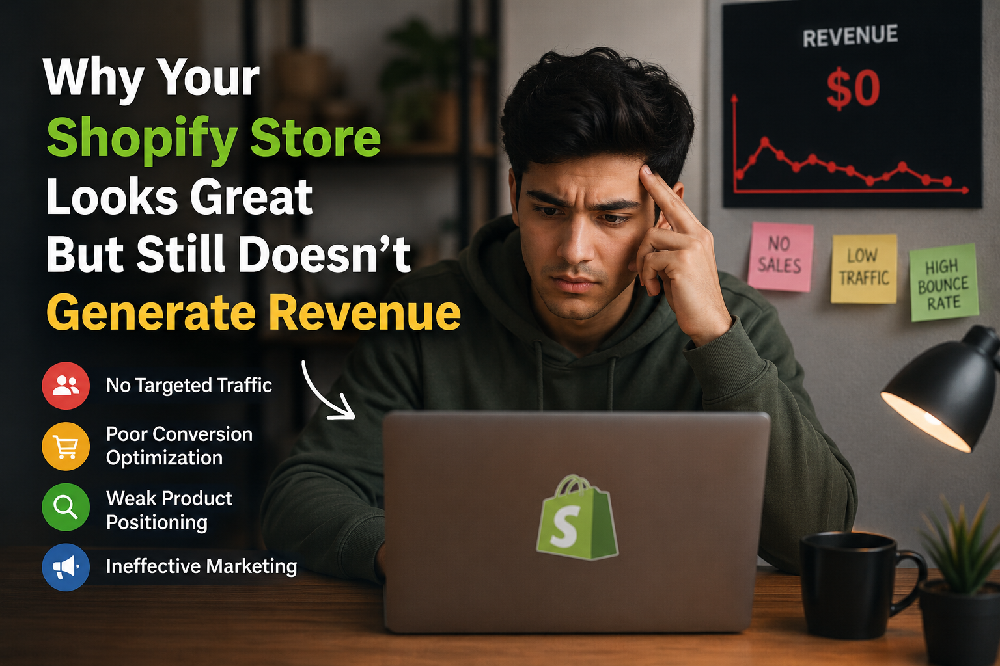
You hired a designer. You picked a premium Shopify theme. You spent weeks getting the fonts right, the colours perfect, the homepage banner exactly how you wanted it.
The store looks genuinely impressive. You'd buy from it.
But your customers aren't.
Traffic comes in from ads, from Instagram, from Google and most of it leaves within 60 seconds without touching a product. Your cart abandonment rate is high. Your conversion rate is somewhere between 0.8% and 1.4%. Your ad spend keeps climbing because you need more visitors just to maintain the same revenue.
This is one of the most frustrating situations in eCommerce and one of the most common. And the reason it happens is almost never what store owners think it is.
The problem is not how your store looks. The problem is how your store works.
Design builds the first impression. CRO Conversion Rate Optimisation builds the second, third, and fourth impression. And those are the ones that actually make people buy.
Is your store losing sales you've already earned?
If your store gets traffic but conversions are stuck below 2%, you have a fixable problem not a traffic problem. Our team will audit your Shopify store and show you exactly where visitors are leaving and why, free of charge.
Get your free Shopify CRO audit →The gap between "looks great" and "converts well" why they're not the same thing
There's a reason the most successful eCommerce stores in the world don't always have the most beautiful designs. Amazon is not particularly beautiful. Flipkart is not winning design awards. But both convert exceptionally well because they are obsessively focused on removing every possible reason a customer might not complete a purchase.
That is what conversion rate optimisation actually is. Not making your store prettier. Not adding more features. Removing friction the specific moments where your customer's momentum toward buying slows down, runs into uncertainty, or stops completely.
And here's what's important to understand: those moments are different for every store. Your friction points are not the same as your competitor's. They depend on your product category, your customer, your price point, and your traffic source. Which is exactly why generic design templates however beautiful can never solve a conversion problem on their own.
7 real reasons your Shopify store looks great but still loses sales
These are not hypothetical problems. These are the specific friction points we find most consistently when we audit Shopify stores that have strong traffic but weak conversion numbers.
Your homepage is beautiful but your value proposition is invisible
A customer lands on your homepage from an Instagram ad. They have approximately 5 seconds to understand: what do you sell, who is it for, and why should they choose you over the 12 other stores selling something similar? Most beautifully designed Shopify homepages fail this test spectacularly. Full-width hero images with no text. Taglines like "Crafted with love" that explain nothing. Autoplay videos that take 8 seconds to reach the product. The homepage looks stunning and communicates almost nothing useful. A customer who can't immediately understand what you sell and why it matters to them will leave — no matter how good your photography is.
Product pages answer the wrong questions
Most Shopify product pages are built around what the brand wants to say fabric composition, design inspiration, brand story. Customers arrive with a completely different set of questions: Will this fit me? What does it look like worn on a body? What happens if I don't like it? How long does shipping take? When a product page answers the brand's questions instead of the customer's questions, it looks complete to the seller and confusing to the buyer. The result is high product page bounce rates — customers who looked, couldn't find what they needed to feel confident, and left to think about it. They rarely come back.
Your store loads slowly especially on mobile
A premium Shopify theme with high-resolution imagery, multiple third-party apps, live chat widgets, and pop-up scripts can easily take 5–8 seconds to load on a mid-range mobile device on a 4G connection. That is 5–8 seconds your customer is staring at a blank or half-loaded screen. 53% of mobile users abandon a site that takes more than 3 seconds to load. Page speed is not a technical nice-to-have it is a conversion critical issue. And it is completely invisible when you're testing your own store from your office on a fast Wi-Fi connection with a flagship smartphone.
Trust signals are missing or buried
A first-time visitor to your store has never heard of you. They don't know if you're a real business, whether orders actually arrive, or whether returns are genuinely hassle-free. They are making a decision about whether to trust a stranger with their money. Trust signals customer reviews with photos, security badges, clear return policies, visible contact information, social proof are what bridge that gap. Most beautiful Shopify stores display these in the footer, in small text, after the customer has already decided whether to buy. They need to be on the product page, above the fold, visible before the customer has to scroll.
The checkout has too many steps especially on mobile
67% of shopping cart abandonments happen at checkout not on the product page, not on the homepage, but at the exact moment the customer was ready to pay. The reasons are almost always the same: too many form fields, no express payment option, forced account creation, unexpected shipping costs revealed only at the final step, or a multi-page checkout that requires 7+ taps on mobile. Shopify's one-page checkout, combined with Apple Pay and Google Pay, reduces checkout to 2–3 taps for returning customers. The difference in mobile conversion between a 7-step checkout and a 2-tap one is not marginal — it is transformational.
You're sending paid traffic to the wrong pages
Many Shopify stores run Instagram or Google ads that drive traffic directly to the homepage. The homepage is a general store overview it is not designed to convert a customer who came from a specific ad about a specific product. A customer who clicked an ad showing a blue linen shirt should land on the product page for that blue linen shirt not your homepage, where they have to find it again. Mismatched ad destinations are one of the most common and most wasteful conversion problems we find because the customer had intent when they clicked, and that intent was immediately frustrated.
You have no post-visit recovery system
Most eCommerce stores treat a visitor who leaves without buying as a lost customer. But a customer who browsed your products for 4 minutes, added something to their cart, and then left that customer was interested. They had a reason not to buy in that moment distraction, price hesitation, size uncertainty, "let me think about it." A cart abandonment email sequence, a browse abandonment flow, and retargeting ads that bring them back with the specific product they viewed are the recovery systems that turn "almost customers" into buyers. Without them, you're leaving 10–15% of potential revenue on the table every single day.
What a conversion-focused Shopify store looks like vs a design-focused one
Design-focused Shopify store
- Full-width hero video no text, no CTA visible above fold
- Product photography on plain backgrounds only
- Returns policy in footer 8pt font, legal language
- Checkout: 4 pages, 11 form fields, no Apple Pay
- Reviews: text only, displayed below the fold
- Page speed: 6.2 seconds on mobile
- Ad traffic → homepage
Conversion-focused Shopify store
- Clear headline + value proposition visible within 2 seconds
- On-body photography showing fit, movement, and detail
- "Free 30-day returns" on every product page above add-to-cart
- One-page checkout + Apple Pay 2 taps on mobile
- Reviews with customer photos and fit notes inline on page
- Page speed: under 2.5 seconds on mobile
- Ad traffic → specific product landing page
The conversion-focused store on the right is not necessarily more beautiful than the one on the left. It is more useful. Every element serves the customer's decision-making process rather than the brand's aesthetic preferences. That usefulness is what converts.
How to actually fix a Shopify store that isn't converting
The right approach to fixing conversion is methodical not instinctive. Most store owners make changes based on what they think looks better or what they've seen another brand do. That approach wastes time and often makes things worse. Here is the process that actually works.
The reason most Shopify CRO efforts fail is that they skip the audit and go straight to changes usually visual changes based on instinct. Without knowing where visitors are actually dropping off and why, you're redesigning in the dark. Our Conversion Funnel Analysis: service gives you the complete picture before any changes are made.
Real result: from 1.1% to 3.4% conversion in 10 weeks without redesigning the store
An apparel brand on Shopify came to Satyanam with a store they were genuinely proud of. The design was clean, the photography was professional, and they had invested significantly in their Shopify setup. But their conversion rate had been stuck at 1.1% for 6 months despite healthy traffic from paid social and Google Shopping.
A full conversion audit identified the problems clearly none of which were visible to the brand because they looked at the store every day and stopped seeing it the way a first-time visitor does.
| Problem Found in Audit | Conversion Impact | Fix Applied |
|---|---|---|
| Homepage had no clear value proposition above fold | High bounce rate from ads | Headline + USP added bounce rate dropped 28% |
| Mobile page speed: 7.1 seconds | 53% of mobile visitors left before page loaded | Image compression + app audit speed to 2.4s |
| Returns policy only in footer | High cart abandonment at checkout | Policy added to product page abandonment fell 19% |
| Checkout: 6-page flow, no Apple Pay | 67% checkout abandonment on mobile | One-page checkout + Apple Pay mobile CVR +41% |
| No cart recovery emails | ₹0 recovery revenue | 3-email sequence 12% of carts recovered |
Final result after 10 weeks: conversion rate from 1.1% to 3.4%. Revenue from the same traffic more than tripled. Not a single product changed. Not a single price changed. The store design remained largely the same. What changed was how well it worked for the customers actually using it.
What the audit revealed and what fixed it
- The homepage hero video was stunning and communicated nothing a simple headline fix reduced bounce rate immediately
- 7-second mobile load time was invisible on the team's office Wi-Fi real-world mobile testing exposed it immediately
- Returns policy in the footer was being read by less than 2% of visitors moving it to the product page addressed the #1 checkout hesitation
- Apple Pay alone increased mobile checkout completion by 41% customers who previously abandoned at the form fields converted with 2 taps
- Cart recovery emails turned "almost customers" into buyers 12% came back and completed their purchase within 72 hours
Northern: When a better shopping experience directly drives better sales
Northern, a customised apparel manufacturer operating across retail and wholesale channels, had a product range their customers genuinely wanted — but a digital storefront that wasn't reflecting that quality or making it easy to buy. Managing a large apparel catalogue with real-time stock across multiple channels while giving customers a frictionless shopping experience is genuinely complex. Their existing setup created friction at multiple points: stock accuracy issues eroding trust, product discovery problems burying items customers were looking for, and a checkout experience that wasn't built for how their customers actually shopped.
Satyanam delivered a fully custom eCommerce solution with live ERP integration for accurate inventory sync, large catalogue management built for how apparel buyers browse, production operations tooling for the manufacturing side, and a customer-facing experience designed around reducing friction at every step. The result: a store that matched the quality of their products and converted at a rate that reflected it.
Read the full Northern case study →Want to know exactly why your store isn't converting?
Satyanam specialises in Shopify development and CRO for apparel and fashion brands. We find the specific friction points costing your store sales and fix them with evidence from real testing, not guesswork.
Book a free strategy call →Three things you can check in your store today right now
You don't need to wait for a full audit to start identifying problems. These three checks take under 20 minutes and reveal the most common conversion killers hiding in plain sight.
Open your store on a cheap Android phone on mobile data
Not your iPhone. Not your laptop. Find the oldest, cheapest Android phone in your office or borrow one. Turn off Wi-Fi. Open your store. Time how long it takes to load. Browse a product. Try to add to cart. Try to checkout. What you experience is what a significant percentage of your customers experience every day. If it feels slow, frustrating, or confusing it is. That experience is costing you conversions right now.
Ask someone who has never seen your store to find and buy a product
Watch them don't help. Note every moment they hesitate, every question they ask out loud, every time they scroll back up or look confused. Every hesitation is a friction point. Every question they ask is information your product page should be answering automatically. Five minutes of this exercise reveals more about your conversion problems than weeks of looking at Google Analytics.
Check your cart abandonment rate in Shopify Analytics
Go to Shopify Analytics → Reports → Checkout conversions. Find your cart abandonment rate and your checkout abandonment rate. If cart abandonment is above 70% and checkout abandonment is above 50%, you have specific, fixable problems in your purchase flow. These numbers tell you exactly how much revenue you are generating versus how much you could be generating from the same traffic and the gap is the size of your conversion problem.
Also read: 7 simple ways to increase AOV without annoying your customers →
Also read: How to get more repeat customers on Shopify →
The bottom line
A beautiful Shopify store that doesn't convert is not a design problem. It is a communication problem. It means your store is not answering the questions your customers are actually asking clearly enough, quickly enough, and at the right moment in their journey.
The good news is that every friction point is fixable. Every hesitation has a solution. And unlike paid traffic which costs more every month just to stay still fixing conversion is a permanent improvement. Every customer who visits your store after you fix a friction point benefits from that fix. Forever.
The store you have right now is probably generating 30–60% less revenue than the store you could have with the same products, the same prices, and the same traffic. That gap is your conversion opportunity. And it starts with understanding exactly where your customers are hesitating and why.
Get your free Shopify CRO audit
Our team will review your Shopify store product pages, homepage clarity, checkout flow, mobile experience, page speed, trust signals, and analytics. We'll show you exactly where you're losing conversions, which problems to fix first, and what impact each fix can have on your revenue. No cost. No obligation. Just a clear, honest picture of what's holding your store back.
Get your free Shopify CRO audit →Frequently asked questions