
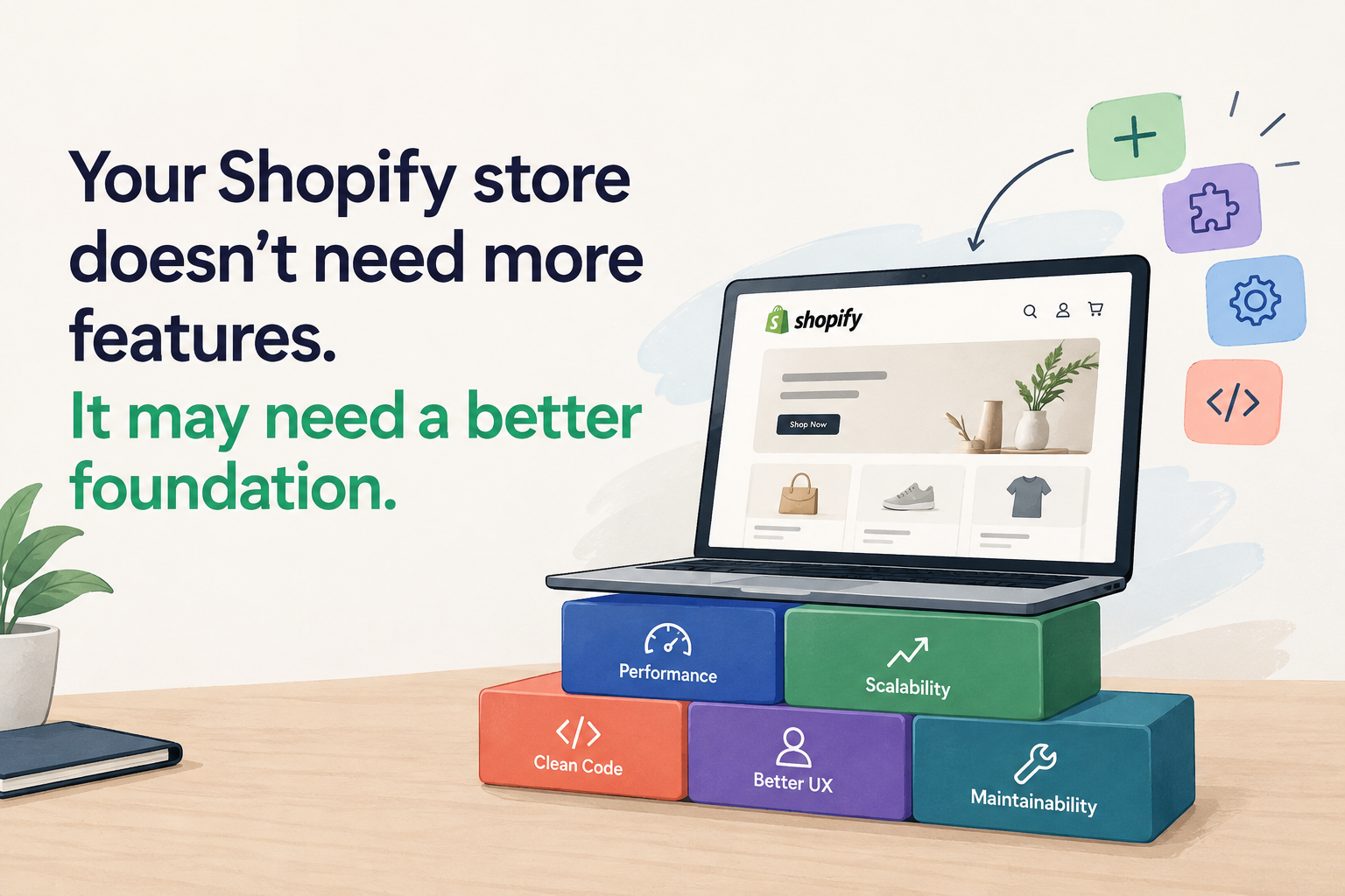
At some point, most growing Shopify stores reach the same quiet frustration. The store works. Sales come in. But something has changed and it's hard to name.
Simple things take longer than they should. Adding a new banner section requires a developer. An app installed for a campaign two years ago is still there, doing nothing, slowing every page load. A product page layout that made sense when you had 30 products doesn't make sense with 300. And every time someone suggests improving something, someone else says: "Be careful last time we touched that, something else broke."
The instinct in this situation is usually to add something: a new feature, a new app, a new section, a redesign. But the problem is rarely a missing feature. It's usually an accumulation of decisions, each reasonable at the time, that have made the store structurally harder to improve.
That's worth understanding before reaching for anything new.
The Shopify store that started simple
Almost every Shopify store begins from the same place: a theme, a handful of products, three or four apps, and a standard set of collection and product pages. It's clean, it's manageable, and it's fast to get live.
Then the business grows. More products mean more categories, more filtering logic, more edge cases in the product page template. More campaigns mean custom sections built for specific promotions that outlived the promotion. More customer requirements mean app installations that each seemed sensible individually. More integrations. More workarounds for things the theme doesn't handle natively.
The store keeps evolving. But not always in a direction that makes it easier to work with. Often in a direction that makes it harder.
The result, after two or three years, is a store that nobody fully understands anymore. Parts of it work for reasons that aren't documented. Other parts create problems for reasons that aren't documented either. The team has developed an implicit knowledge of what not to touch and that implicit knowledge is the most accurate indicator that the store's foundation has become the constraint.
The "patch one more thing" problem
The way stores reach this state almost never involves a single bad decision. It involves many small, reasonable ones.
Custom code was added for a seasonal campaign. The campaign ended, but the code stayed because removing it felt risky and there was always something more urgent to do. An app was installed to handle a feature the theme didn't support. Later, a different app was installed that partially overlapped with the first, because the first didn't quite do what the second requirement needed. Another workaround was added on top of a previous workaround.
None of these decisions were wrong in isolation. Collectively, they created a store where:
- Nobody is entirely sure what the custom code in the theme footer does
- Two apps are both injecting loyalty-related scripts and nobody knows which one is active
- A template modification for a product type three years ago is affecting a product type added last month
- The theme's section schema has been edited so many times that adding a new section sometimes breaks the editor
This is not a crisis. It's a maintenance and velocity problem and it's one that gets more expensive with every month that passes before it's addressed.
7 signs your Shopify store has outgrown its current setup
These signs don't usually appear all at once. They accumulate gradually, which is exactly why they're easy to normalise until they become genuinely expensive.
Small changes require developer involvement every time
Shopify's theme editor should allow merchants to update content, adjust layouts, and manage sections without touching code. If your team can't change a homepage banner, add a trust badge to the product page, or update a navigation link without calling a developer the store's architecture is not working as it should. This is usually a sign that sections were built without proper schema configuration, or that content is hardcoded into Liquid templates rather than made editable through the theme editor.
Your theme contains years of customisations that nobody fully understands
When the answer to "what does this code do?" is "we're not sure, but we don't touch it," that code has become a liability. Shopify themes that have been customised repeatedly over several years often contain conditional logic, overrides, and modifications that interact in ways nobody currently on the team can fully explain. This creates a situation where every change carries an unpredictable risk of breaking something adjacent and the team manages that risk by making as few changes as possible, which is its own kind of operational cost.
Multiple apps perform overlapping functions
It's common for a store to have an upsell app installed for one campaign, a different upsell app for another, and a product recommendation section from the theme, all of them running simultaneously. Or two review apps because the original one was replaced but not fully removed. These overlaps create performance overhead (multiple scripts doing similar things), UI conflicts (two elements competing for the same page position), and confusion about which tool is actually controlling which behaviour. An audit of what each installed app actually does and whether it's still needed is one of the highest-return improvements a store can make before any redesign.
Mobile and desktop experiences feel inconsistent
A store where the desktop experience is polished and intentional but the mobile experience feels like a compressed version of it with tap targets that are too small, text that's too dense, and sections that don't quite lay out correctly at narrower widths is a store that was built desktop-first and then responsively adjusted, rather than designed from the customer's actual browsing context. Since most eCommerce traffic is on mobile, an inconsistent mobile experience is a conversion problem, not just an aesthetic one.
New features keep breaking existing functionality
When installing a new section, updating a template, or adding an app consistently causes something else to stop working correctly, that's a structural problem. It usually means the theme's customisations are tightly coupled changes in one area have unintended effects on another and there's no clear separation between what each part of the theme is responsible for. In a well-architected Shopify theme, adding a new section shouldn't be able to break the cart. In a poorly architected one, it can.
Your product pages don't reflect how customers actually shop
A product page template built when the store had 30 products and a simple catalogue may not serve a store with 300 products across multiple categories with different attributes, different trust requirements, and different decision-making contexts. If your product pages show the same structure regardless of whether the product is a £15 consumable or a £400 considered purchase regardless of whether customers need size guides, comparison tables, or detailed specifications the template is working from the wrong assumptions. Product page structure should reflect the customer's decision-making process, not the original developer's default layout choices.
The team is afraid to change something because something else might break
This is the most honest and the most expensive sign. When the team's institutional response to any proposed change is caution about what it might accidentally break when even small, isolated edits feel risky the store has accumulated enough technical debt that its architecture is limiting the business's ability to move. This isn't a team problem. It's a code structure problem that creates rational caution in people who have seen what happens when something breaks unexpectedly in a production store.
Recognise your store in any of these?
We review existing Shopify stores and give an honest assessment of whether the architecture is sound, where the gaps are, and what approach makes the most sense. No proposal attached just a clear picture of where things stand.
Book a free Shopify store review →Redesign vs. rebuild vs. optimise and why it matters which one you need
The most important thing to establish before any investment in a Shopify store is what the actual problem is because the right answer depends entirely on that. Not every store with the signs above needs a complete rebuild. And not every store that just needs optimisation should go through a full redesign.
Optimise
When the foundation is structurally sound and specific, identifiable problems need fixing.
- Page speed improvements
- App audit and removal
- Checkout friction fixes
- SEO corrections
- Mobile layout adjustments
Redesign
When the customer experience, visual hierarchy, navigation, or product presentation needs improvement but the underlying architecture is usable.
- Navigation and product discovery
- Product page structure
- Mobile UX
- Trust and conversion elements
- Content hierarchy
Rebuild
When the theme architecture itself is preventing the business from moving forward and the cost of working around it exceeds the cost of replacing it.
- Years of unmaintainable customisations
- Every change breaks something
- Merchant can't edit content without code
- Mobile experience needs full rebuild
- New functionality requires starting fresh
The reason this distinction matters: a redesign applied to a poor architectural foundation produces a store that looks different but has the same underlying problems. A rebuild without first understanding the specific customer experience gaps the store has risks producing a technically clean store that still doesn't convert well.
Getting the diagnosis right before the investment is the most valuable thing a store owner can do at this stage.
What a good Shopify redesign should actually change
A redesign shouldn't simply mean making the store look newer. Visual freshness is a side effect of a well-executed redesign, not the goal of it. The goal is a storefront that works better for customers and that the team can maintain and improve without friction.
The elements worth examining in any redesign:
What a redesign should address in the order customers encounter it
- Navigation : can customers find what they're looking for without browsing randomly?
- Product discovery : does search, filtering, and category structure match how customers think about the products?
- Product page structure : does the layout reflect how customers make buying decisions for this specific product type?
- Mobile UX : is the experience built for a thumb on a phone screen, or adapted from a desktop layout?
- Cart experience : is checkout the simplest possible path from intent to order?
- Trust elements : are reviews, return policies, and security signals visible where customers need them?
- Performance : does the page load before customers lose patience?
- Content hierarchy : does the most important information appear where customers look first?
- Maintainability : can the team update the store without involving a developer for every change?
Redesigns that address this list produce stores that convert better and cost less to maintain. Redesigns that focus primarily on visual style often produce neither.
Before redesigning: questions worth asking honestly
The most useful exercise before any Shopify redesign or rebuild investment is a straightforward audit of what the current store actually does and doesn't do not what was intended, but what is genuinely true today.
What specifically isn't working today and how do we know? Is there data to confirm it?
Which pages create the most friction for customers, based on analytics rather than assumption?
Which features are customers actually using and which exist because they seemed like good ideas?
Which apps are still actively needed, and which are installed remnants of previous requirements?
What should Shopify handle natively in 2026 that it couldn't handle when we first built the store?
What genuinely requires custom development, and what just requires proper Shopify configuration?
What should the new theme make easier for the team to manage without developer involvement?
How will we measure whether the redesign actually improved things and by when?
Stores that go through this process before starting a redesign end up with clearer briefs, more realistic expectations, and better outcomes. Stores that skip it tend to produce redesigns that address the symptoms without changing what was actually causing them.
The goal isn't a new-looking store
A successful Shopify redesign or rebuild, or optimisation isn't measured by whether the store looks more modern than it did before. Visual appearance is easy to change. What's harder to change, and what matters more, is how well the store works for the people using it.
Three things make a Shopify store genuinely better: it's easier for customers to use, it's easier for the business to manage, and it's easier to improve in the future without everything breaking.
A store that achieves all three doesn't need a new feature next month. It needs deliberate care applied to the right problems in the right order.
If you're currently in the situation described in the seven signs above where the store works but feels increasingly difficult to improve the most useful first step isn't to start planning a redesign. It's to understand specifically what is causing the difficulty, and whether fixing it requires a visual change, an architectural change, or simply removing the accumulated weight of things that are no longer needed.
That understanding is free. And it's usually more valuable than anything else that comes after it.
Not sure whether your store needs optimising, redesigning, or rebuilding?
We review existing Shopify stores and give an honest, specific answer, no jargon, no generic recommendations, no automatic push toward the most expensive option. If your store needs a targeted fix, we'll say so. If it needs more than that, we'll explain exactly why.
Get a free Shopify store evaluation →Frequently asked questions